Weekly ad pages aren't made for mobile screens. When I was managing ShopLocal's Design Team, our first approach to presenting ad content on mobile screens was to ditch the pages, and just present information. But user behavior and comments suggested this approach created two big issues.
First, no matter how the content was labeled, many weekly ad users felt they'd taken a wrong turn as soon as the familiar visuals of the pages went away.
Second, users trust the value of a printed offer. Without visual evidence of printing, users were more critical of the content, increasing the likelihood of site abandonment.
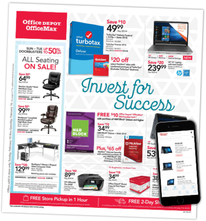
But a page shrunk to fit a mobile screen is illegible. Users must rely on photos to identify the item (not great for shoes, terrible for laptops). Pinch-and-zoom causes unintended clicks, and redrawing all the hotspots on the page causes the site to lag.
We needed a way to make the browsing experience easy, engaging … even fun.
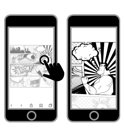
Looking for inspiration outside of the world of retail, I came across the comic book solution: use the tap gesture to zoom in on a single panel so it's as large as the screen will allow.
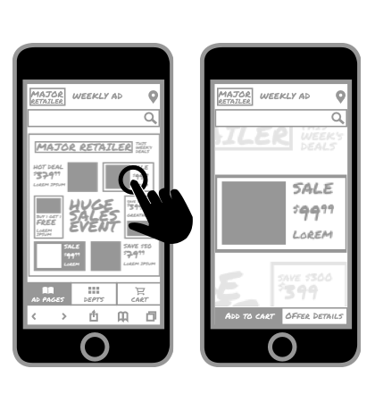
Once zoomed in, the user to swipes from panel to panel in sequence.
If users no longer want to view every item on a page, they tap again to zoom out to the page level.
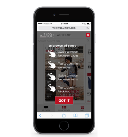
Testing showed the majority of users were able to intuitively grasp the new browsing concept, but I wanted every last user of our prototype to get it, hence this one-screen tutorial. We used cookies to make sure only first-time visitors would see it.
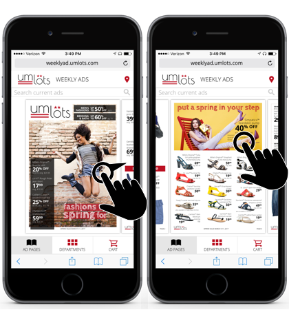
While not ideal for browsing specific items, pages can help users get to a category that interests them.
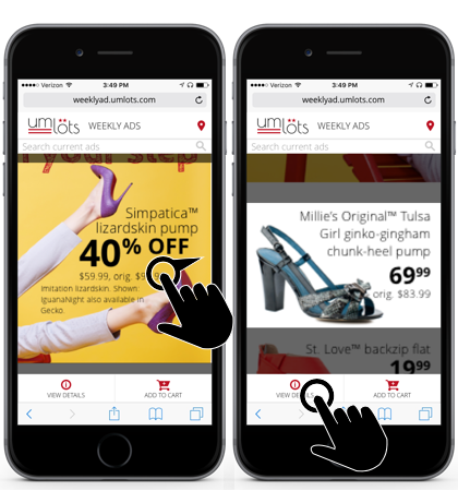
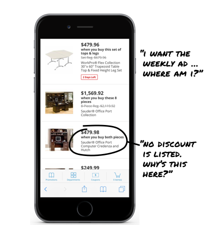
At the item level, text is usually legible, and calls to action allow users to purchase online.
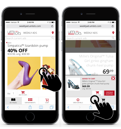
From there, users can find out extra details on the item that may not have appeared in print (extra images, etc.), add it to their cart, and then continue browsing. This site did offer more traditional means of browsing, like keyword search or department selection, but testing showed this new approach to page browsing was the "happy path" for most users.
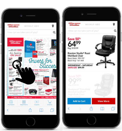
Several retailers adopted this new approach to mobile browing. As of February 2019, Office Depot is still using the solution I designed.