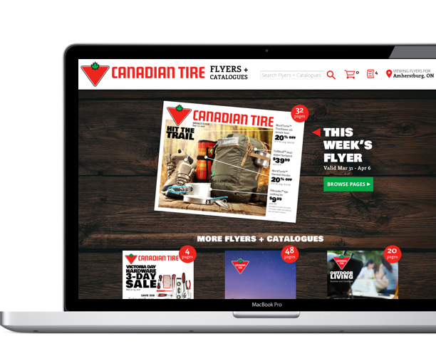
This set of these desktop designs were custom tailored to suit Canadian Tire's flyers.
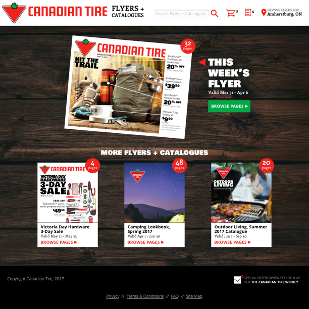
One of ShopLocal's oldest clients was Canadian Tire. For years their Weekly Flyer site looked like this. This design performed decently, but most users only viewed one ad, and nothing else. The client wanted more users to see content from catalogs, as well as bonus online-only offers.
Rather than try to reroute the users' existing "happy path," I wanted a solution that would leverage the strengths of Canadian Tire's flyers.
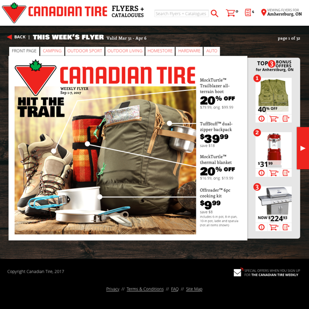
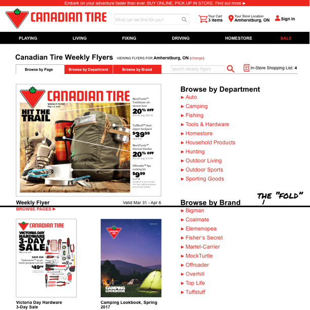
In print, Canadian Tire used a landscape orientation that fit desktop screens pretty nicely.
They also organized their flyer in a consistent manner, so loyal readers knew auto parts were at the back, camping equipment at the front.
Rather than battle against these positives, I wanted to make them work for us.
So I ditched the client's header, eliminating search and category options relevant only to the client's dot com. This helped boost those catalogs up into view, so at least users might be aware of their existence.
I also dropped features for browsing by category or brand, to put even more focus on what our users were most drawn to already: browsing that featured flyer.
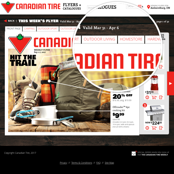
A chief strategy for boosting the prominence of that additional content was something I nicknamed the "sidecar."
Designed to "peek" out from behind the page, the sidecar offered flexibility while still visually connecting with the flyer. The position between the page and the "next" button meant it wouldn't be tuned out like most right-rail web content.
Here the space is used to offer a few of the client's "bonus offers" not seen in print (ranked according to my company's geo-location-specific "wisdom of crowds" algorithms) but the space could be utilized differently page to page.
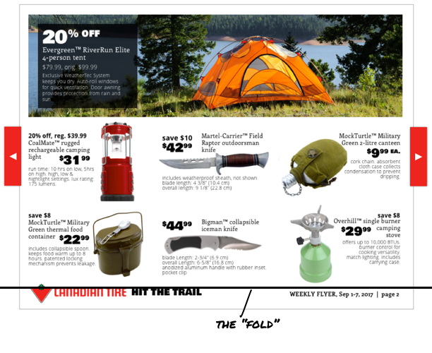
I encouraged the client to embrace the sidecar's limited space, bearing in mind that as users flip through the ad, that space would be multiplied 32x (or even more, with the addition of chapter breaks).
The sidecar could highlight relevant content from the under-viewed catalogs, with a link to explore them more fully. Manufacturers could buy out the space (something they often do with printed ads), or social media could be showcased. The best use of the space would be relevant to bargain shopping and the selected category, but there were no real limits to how the space could be used.
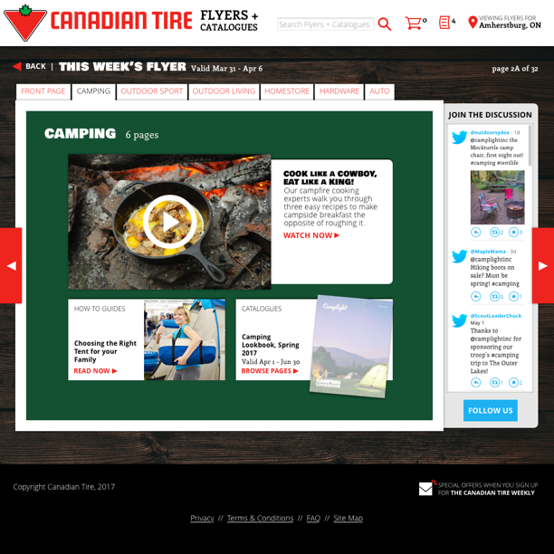
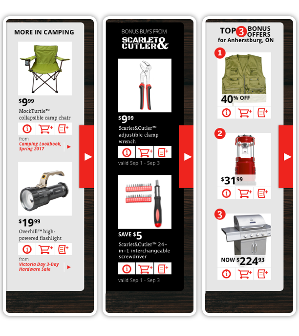
I mentioned Camplight's consistent organization of their flyer week to week: while front page content might vary, Camping equipment could be found on pages 2-7, hunting and fishing on pages 8-11, etc.
This made it possible to add tabs across the top without fear that the number of departments or a lengthy department name could cause us to run out of space. The tabs let users jump to a department of interest (a key feature with 32 pages of content), but I made additional use of those chapter divisions.
Whether arrived at via a tab or merely paging forward, each department/chapter of the flyer is preceded by an interstitial "page" — a canvas much like the sidecar, designed to pull in bonus content (shown here as supplemental lifestyle content) or additional ads or catalogs.
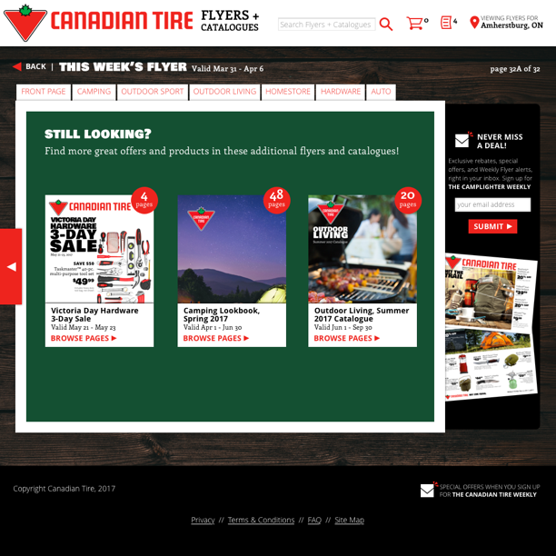
Our last attempt to drive traffic to those other print pieces was this continuation prompt, following the pattern of the chapter breaks, coming after the final page of the ad. I also utilized this final sidecar to promote email signup.
While we did support mobile users, the bonus content strategies covered here were hidden away on mobile. (For a look at mobile strategies, see Weekly Ad - Mobile.)